Weeks 5 & 6
For those of you who follow us on Instagram, you'll know we've been answering your Design Dilemmas every Friday. Heather and I have loved delving into these and it's so good to hear that you've been enjoying them too! Here are the fifth and sixth installments - please share your thoughts in the comments, or send us your own query here.
W5 | Dilemma #1:
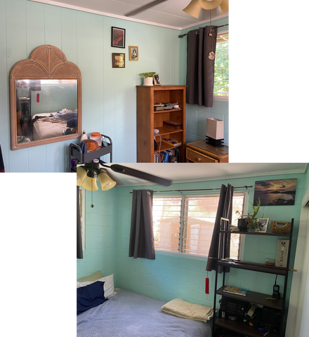 via: @pausetowonder
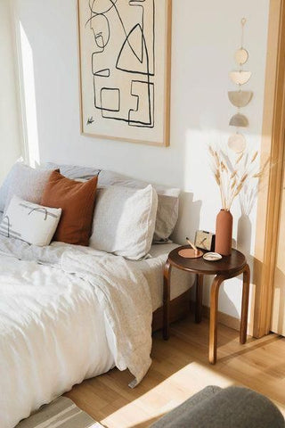 image source: Wit & Delight
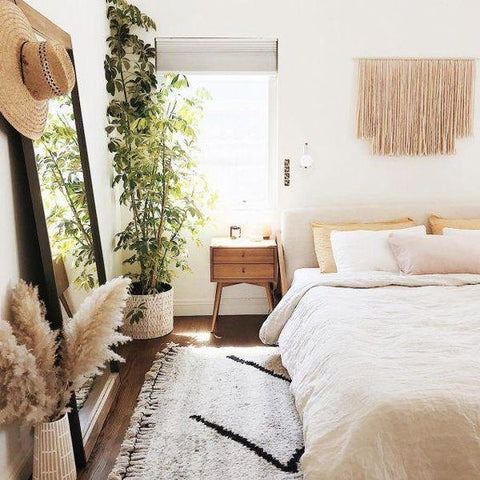 image source: @almostmakesperfect
Dilemma #2:
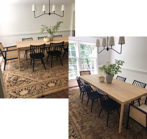 via: @kelsey_maloy
Wow, what a beautiful room... and rug... and light! The bottom of the room is feeling a bit heavy, so in order to lighten it up, I would add white linen or sheepskin seat cushions, to bring some white a bit lower. Our favorite floor to ceiling linen curtains would also look great in here.
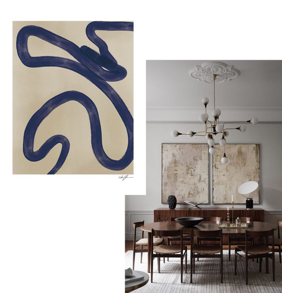
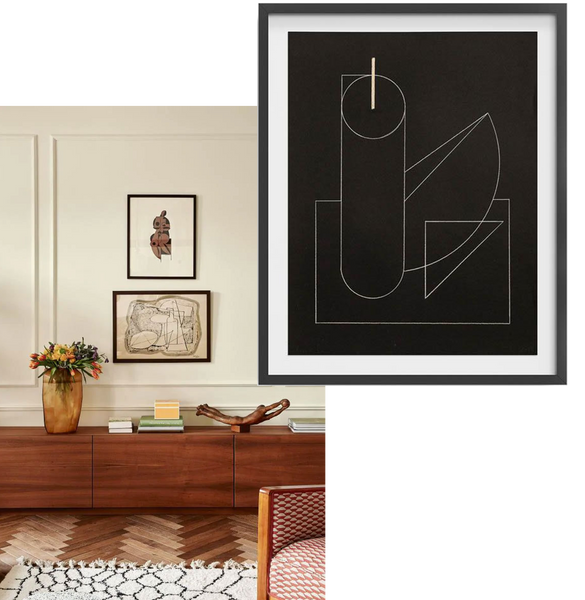
Alternatively, you can always find great art on Etsy, or use black & white photographs.
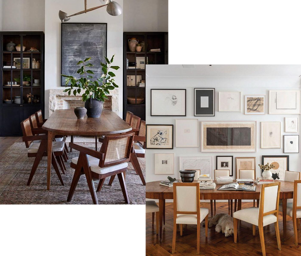 image sources left to right: Amber Interiors | Ali Havens
Dilemma #3:
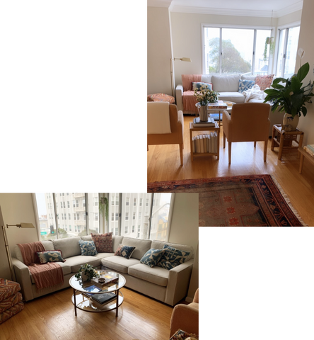
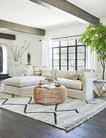 image source: Lulu and Georgia
W6 | Dilemma #1:
"I literally just moved into my dream apartment in Lisbon but I'm a bit stuck on how to organize my furniture. I work from home so was thinking the little room attached to the living space could be an office. I would love some advice on how to decorate or lay it out!"
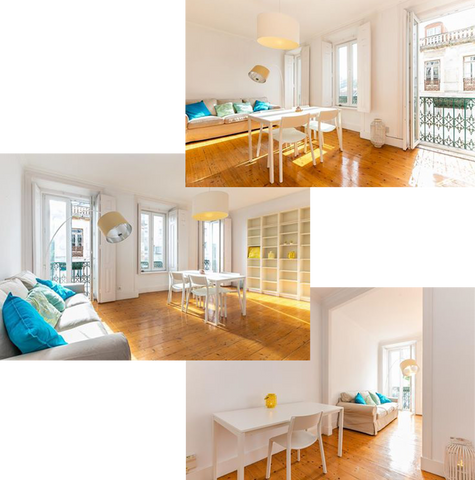 via: @madlynsmyth
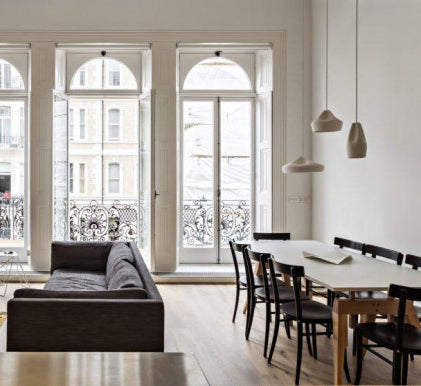 image source: Marset
Rugs are also great for separating spaces and mixing a jute and antique will keep yours feeling light and bright. We'd recommend this La Redoute jute...
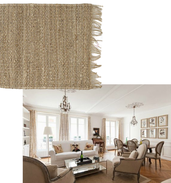 image sources top to bottom: La Redoute | Paris Perfect
... with Heritage 0061 over the top. Not only will this look great in the space, it'll also cool down the yellow a bit.
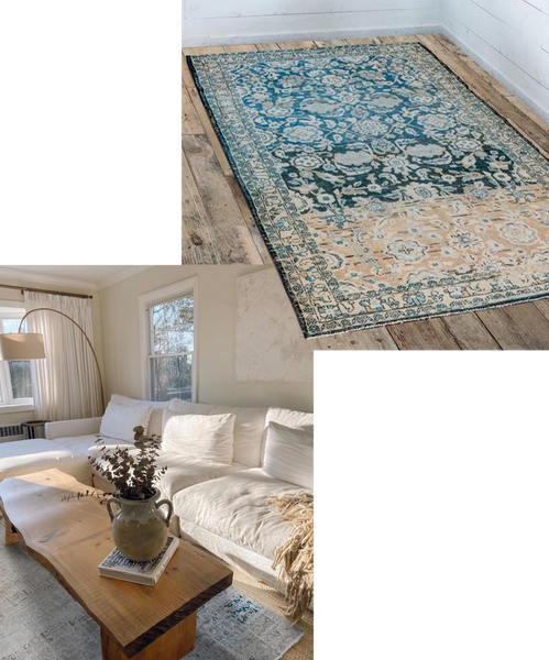 image sources left to right: Chelsea Glattman | rug: Frances Loom
In the office, all you need is a large scale piece of art over the table. You could attempt one yourself (I do this all the time, as you can see in my kitchen) or buy a great print like this, to keep a lovely coastal feel.
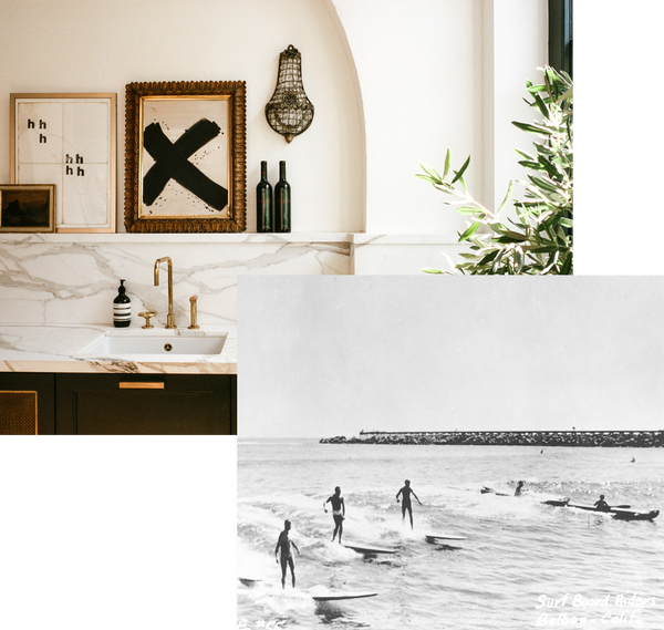 image sources left to right: Heather's kitchen, photographed by Alicia Waite | Anewall
I'd do a small beni under the desk, to keep your feet cozy when you're working.
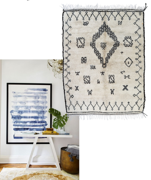 image sources left to right: Crystal Sinclair Design | The Rug Souk
And lost but not least, I'd pop a vintage chair in for a bit of texture. Vinterior is my favorite European site for antique hunting. This one is inexpensive and neutral.
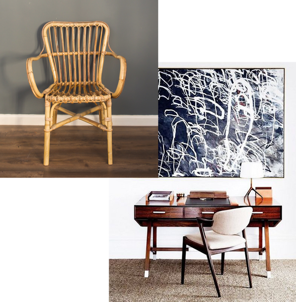 image sources left to right: Vinterior | Homes to Love AU
Dilemma #2
"I'd like your advice on this room... I bought a modular couch for flexibility and can either have it arm or armless. I think my carpet is also too small. Would love to hear what you think!"
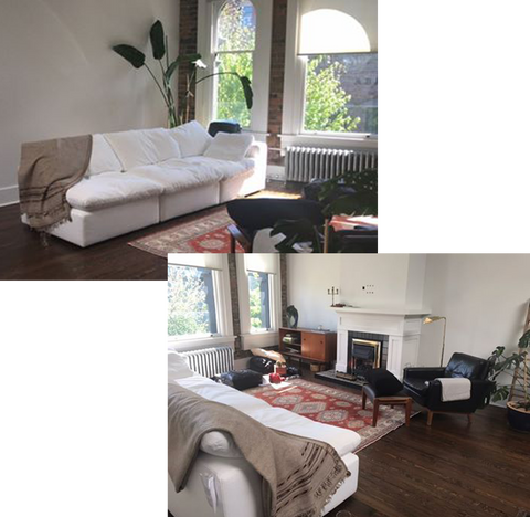 via: @azar_e
This space is amazing! Okay, so I love the sofa without arms... but only if it's for decorative purposes. If you're planning to lounge on it, I believe that comfort has to take precedent. If, like me, you enjoy snuggling in and getting as comfortable as possible, then you're definitely going to want the arms attached. Your place reminds me of Carly's and her sofa's arms are firmly on!
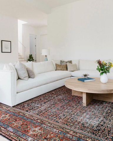 image source: Carly Waters Style
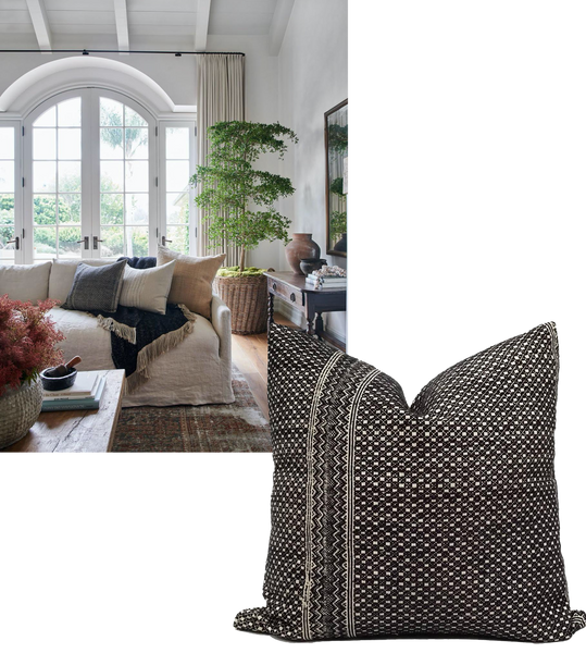
Adding some throw pillows will also make it feel effortless and even more snuggly!
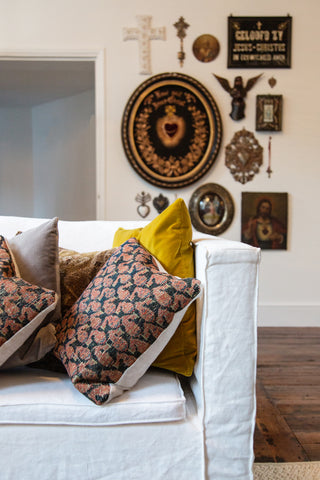 image source: Heather's living room, photographed by Hannah Mae Clark
As you said, the carpet is too small. The easiest remedy is just to get an area-sized jute and then layer yours on top. In terms of size, you'll want something big enough that allows the front legs of the sofa and chairs to rest on it. From your photos, it looks like you'll probably need something around 6' x 9' or 8' x 10'
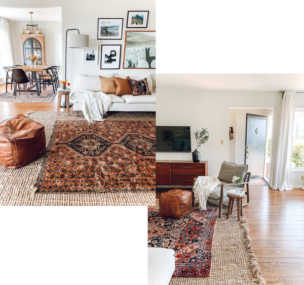 image sources: Rebecca and Genevieve
Alternatively, you could move your current rug to another room and purchase a larger one like Heritage 0062 to go in here!
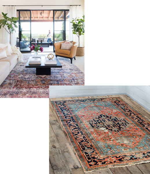 image source: Camille Styles | rug: Frances Loom
Dilemma #3
"I recently moved into this apartment in LA. My first order of business once quarantine is over (or during if possible!) is to get a dining room table and chairs. Would love your help or any inspiration!"
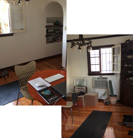 via: @m12linden
Since the dining room is really its own space, I think you'll want to keep the furnishings relatively minimal and modern, so that the room doesn't close in on itself. Definitely get a round table, to keep the flow of the room moving. I absolutely love this one from CB2.
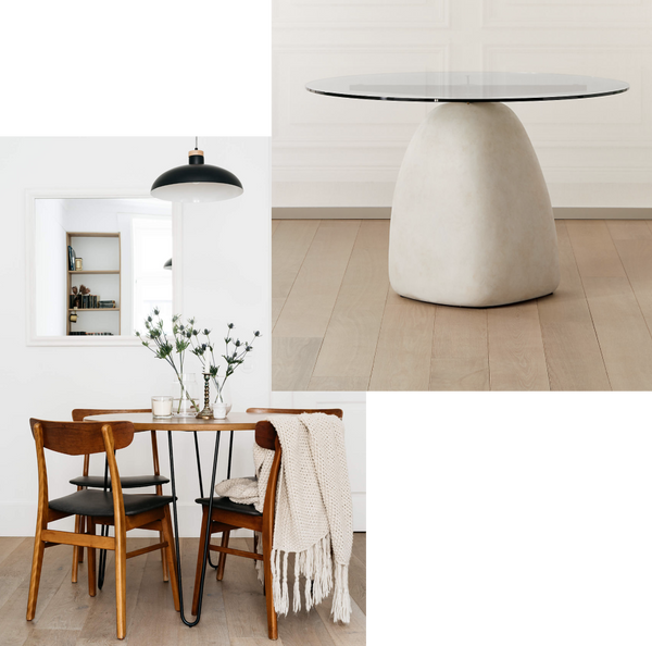 image sources left to right: The Lisboans | CB2
I also found this used West Elm one on facebook marketplace in LA...
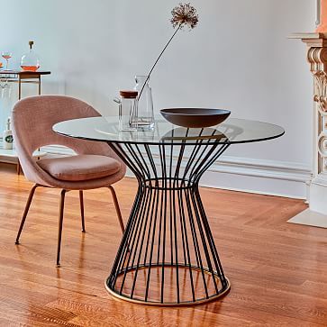 image source: West Elm
I would then add some chairs like these lovely leather ones, or some that are a little more mid-century like in the first inspo pic!
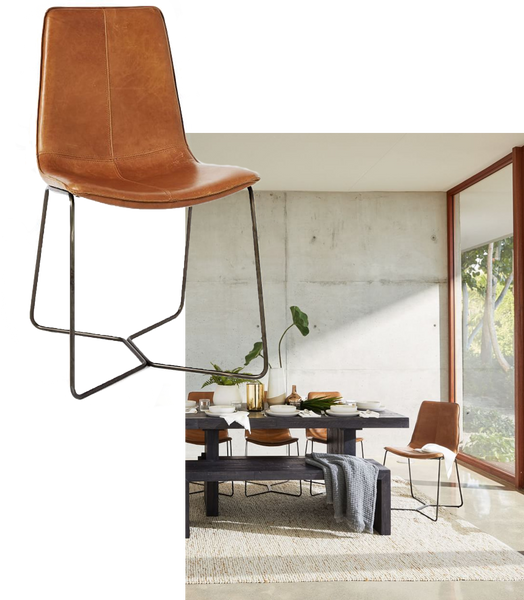 image sources: West Elm
If it's possible, switch out the light fixture to something that feels less heavy. Something as simple as this Ikea one would be great.
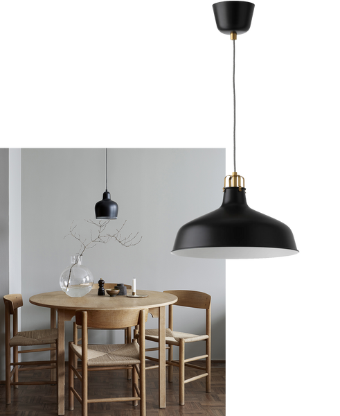 image sources left to right: Per Jansson | Ikea
...or add a little texture with a woven one like this.
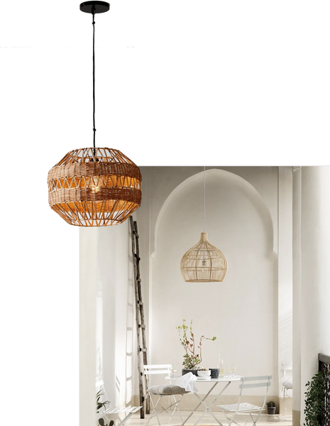 image sources left to right: West Elm | The White Company
Finally, I would add a bit of color with some framed artwork on the walls. I can see you've got some resting on the floor so hang one or two of those around, and perhaps get a tree for the corner!
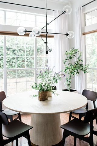 image source: The Identité Collective


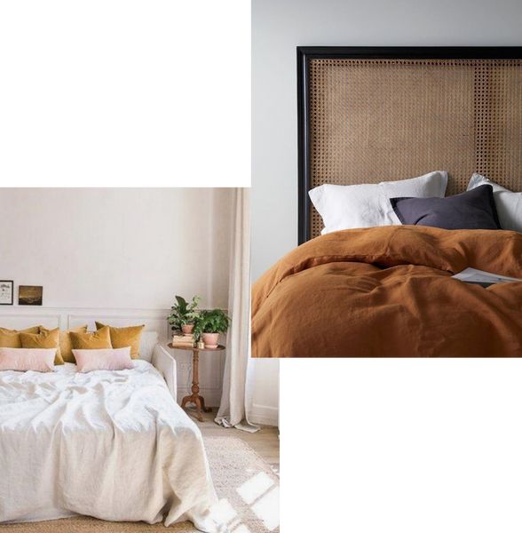
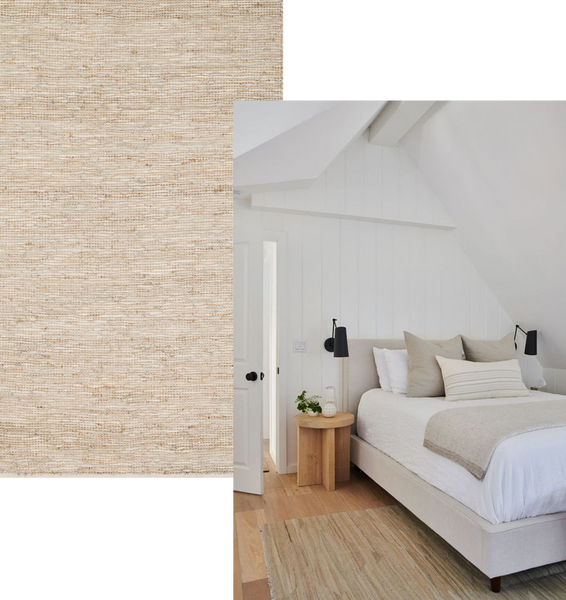
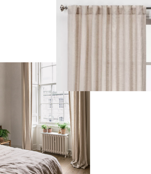
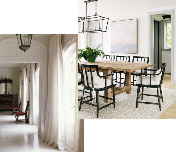
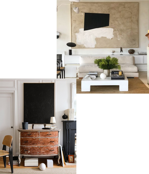 image sources left to right:


Leave a comment